Two new chart types
are introduced in SSRS 2016 CTP3. Tree Maps and Sunburst Charts
Tree Maps
What are Tree Maps
Tree maps use nested rectangles to show
hierarchical data. The size of rectangle is proportionate to the numeric
quantity.
When to use Tree
Maps
Tree maps are good for viewing hierarchical
data, seeing contribution of each category to the whole & for comparing
proportions between categories.
Getting Started
with SSRS 2016
Install Visual Studio 2015 or 2013.
Download SSDT Preview from here - https://msdn.microsoft.com/en-us/library/mt204009.aspx
Creating Tree Maps
in SSRS 2016
We will use the following query against AdventureWorks database
to generate the Tree Map.
SELECT
cast(round(sum(f.SalesAmount)/1000,0) as int) SalesAmount,
t.SalesTerritoryGroup, t.SalesTerritoryRegion
FROM [dbo].[FactInternetSales]
f
JOIN [dbo].[DimSalesTerritory]
t
on t.SalesTerritoryKey =
f.SalesTerritoryKey
WHERE OrderDate between '20120101' and '20131231'
GROUP BY
t.SalesTerritoryGroup,
t.SalesTerritoryRegion
Steps
1.
Create a new chart report in Visual Studio.
2.
In the chart type select “Tree Map”

3.
Fill in Category Groups, Series Groups and
Values.

4.
In the Tool Tip Add Sales Amount ( Right Click
on Chart and Select “Series Properties” to see tooltip)

The report is ready !!

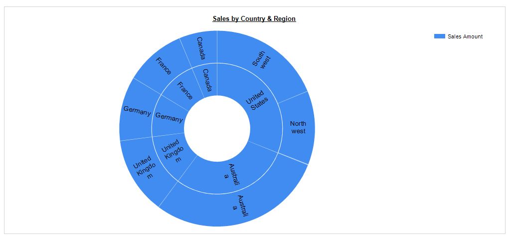
Sunburst Charts
What are Sunburst Charts
Like tree map, sunburst chart is good for displaying
hierarchical data. The rings of sunburst represent hierarchies. The innermost
circle represents top level hierarchy and outermost circle represents the lowest hierarchy. Note: When there is a no hierarchy, a sunburst looks like a
doughnut chart.
Creating Sunburst Chart in SSRS 2016
To create sunburst chart, select chart type as Sunburst.
To create sunburst chart, select chart type as Sunburst.

Fill in Category Groups, Series Groups and Values.

The chart is ready !!

To show
concentric circles for hierarchy levels, add the levels to category groups.

Treemaps vs
Sunburst Charts
- Tree maps are better suited to compare values among levels in a hierarchy. This is because our mind can distinguish rectangles easier than slices in a sunburst chart.
- When there are more than two levels in a hierarchy, a tree map can get confusing, a sunburst can easily display multiple levels of hierarchy by adding additional concentric circles.
- Tree maps do not waste space and can show lot more data than sunburst. The sunburst chart can waste lot of data space because they fit circles inside a rectangular window.
No comments:
Post a Comment